Blown away by the magnitude of this feat! So exciting, took the country by storm again with space related viewing :) Aptly taken opportunity of Red Bull to be plastered all over the ship and astronaughts suit! World viewing will increase sales? Further development of their brand for an adventure seeker!
Red Bull 'Felix Baumgartner's supersonic freefall'
Sunday, 28 October 2012
Typeface choices increase for web design
This programme allows much more flexibity in typefaces used on the net in web design. Easy functionality and interface allows quick changes and modifications :) looks fun!
http://beta.typecastapp.com/
http://beta.typecastapp.com/
Monday, 22 October 2012
The Dot
Google land!

Underground at Google lies the colour coordinated server lines, in Google's finest colour array! This photo of the data centre blew me away - the level of careful attention and lengths of creativity in their brand development are exciting and astounding!
Formfiftyfive
Correct paw placement - raising money for battersy cats and dogs home with this poster that shows 4 paw chords! Using play on words of chord names with the word cat, e.g dominant cat. Particularly like the small black nose added to the white key gap between e and f to make silhuette of a cat's face!

Monorail cat

The use of iconic and well reconisable london map as an influence. The intertwining lines form the shap of cats face, this is playful and for those who ever see shapes in a random mixture of lines! Particularly like the small ears added to the london underground red circle to fit the cat theme.
Saturday, 20 October 2012
adverts
Mcdonalds
WILD FIRE tees
Inspirational design story involving volunteer designers and production team making t-shirts regarding the fires in Colorado with the donation of all funds going to support those assisting with the fires, such as the Red Cross. Underestimated the demand and were going from expected 200 tees by 13,000 percent! Current designs available on their website include:
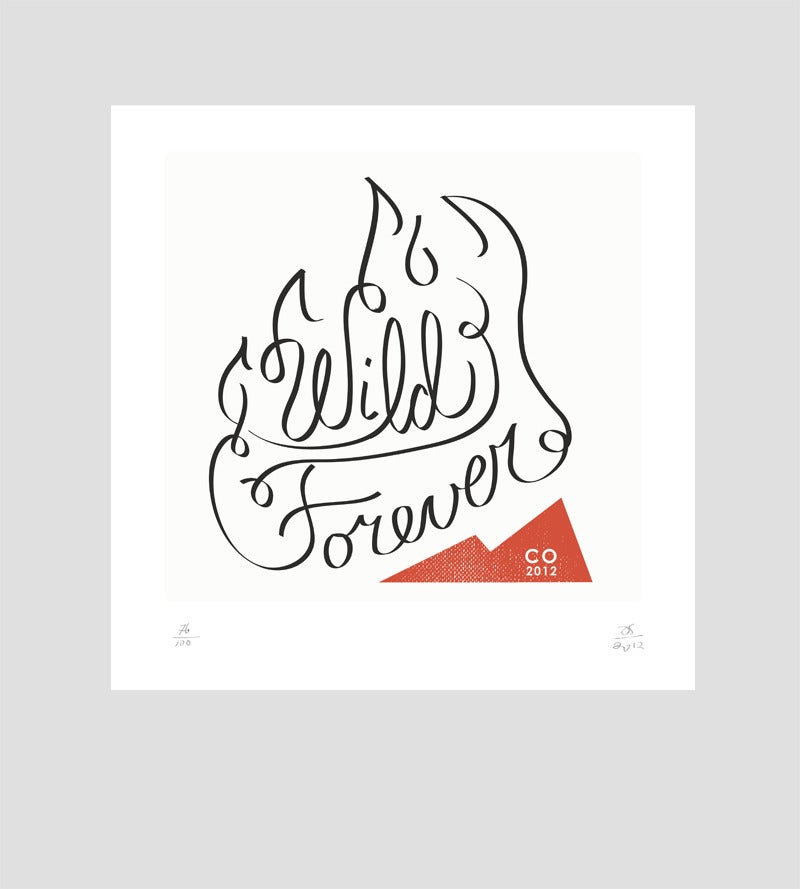
Cute type based design using the text and swirls to incorporate the shape of fire.

AIGA
Collection of AIGA designed posters for anyone to go online and look through, print and self distribute to encourage Americans to Vote in the upcoming elections. Participation and interaction in a larger calling enables the people to help the people. Strong and varied designs are eye catching and visually suprising or challenging - designed by AIGA members and about 200 were in an online gallery to choose from. Here are a few that stood out:

Grungey and dirty feel to the textures, colour and subject matter draw attention to the request to vote by suggesting the consequences otherwise. Powerful and bold type and use of red inforces intensity.

Catchy and visually surprising, Aiga states it uses the " bait-and-switch technique" to draw in a younger audience.

A poster design for designers - its use of typography and reference to trends and styles would appeal to those using them and understanding them on a deeper level. Also the poster is less quick to interpret then some of the others, the script type is harder to read.
You tube
Interesting film concept that plays with standard cinema/film expectations - the setting is in an indoor location with lines on the floor depicting the rooms and houses on that street, without walls! No music being played focuses attention on the detail of acting and intimacy of the moment, its raw depicting feeling more true to life.
Wednesday, 17 October 2012
Friends of Type
friendsoftype.com

awesome contrasting colours that reflect the retro sign style - love the layers created through some use of opacity on them. Mix of serif and sans serif works well as the serif type has wide broad strokes too.

Beautiful hand writing style - unique edge with its variety of broad and thin strokes within its own rules - not too even or ordered, the swirls create help fill the space evenly.

Crossing letter strokes cause colour change - reminds me of the overlapping circles to show colour wheel mixing : attractive and striking. Colours both contrast (cyan and red) and complement (cyan and cream, red and cream). The symmetry is appealing.
Teacake Design
teacakedesign.com

Beautiful precision in fine line image through plate printing methods.

Using type to form recognisable christmas objects, careful choice of words for their amount, in order to fit the shape and also to further explain the object (with a touch of dry wit). Variety of type size and family for each card, keeping to a monotone colour and using minimalistic white background give strong and smart finish.

Pretty handwritting type that is simular to how children are taught to write, note style of "s". Its the neatest and aesthetically pleasing childlike writting.
Subscribe to:
Posts (Atom)