smart, professional, even spacing, uses smaller adobe logo

Minimalistic cards appear smart, sleek and beautiful palette

One tone imagery over roughly a quater of the card, not too overpowering and contrasting to plain b/g. text underneath on one quater. the edge of design leads eye diagonally down - dynamic!

Type only. Front has brand name only. block type and split line layering implies strength, power and precision. -suit architecture design.

Business card nature allows for more gymmicy, cheesy or stereotypical interpretation of the brand.

Folds out to form 3d character - could design building. - a how to, type of design. outlined forms with black line are defined, have cartoon association.

Folds into box. brown card and imagery fits box theme, and tone of colour of imagery. Could have imagery of building windows and you stack to form buildings?

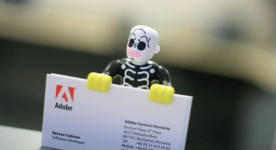
Making the product into a character for relatableness!
No comments:
Post a Comment